00:00
00:00
dz2001
Cthulhu fhtagn!

Age 39, Male

Russia, Moscow

Joined on 8/8/01

Level:
23
Exp Points:
5,426 / 5,880
Exp Rank:
8,489
Vote Power:
6.44 votes
Rank:
Police Officer
Global Rank:
15,915
Blams:
345
Saves:
270
B/P Bonus:
10%
Whistle:
Normal
Trophies:
20
Medals:
83

MMM 3 Beta testing

Posted by dz2001 - June 25th, 2008


Well... not really :P Its far from ready, however you can take part in beta testing and help me find bugs/errors etc.

Momentum Missile Mayhem 3 Beta testing is over, thanks everyone.

If you have found any bugs, or have questions/suggestions - either post here or go to MMM 3 Forum.

If it's not loading - hit refresh/F5.

Update 1
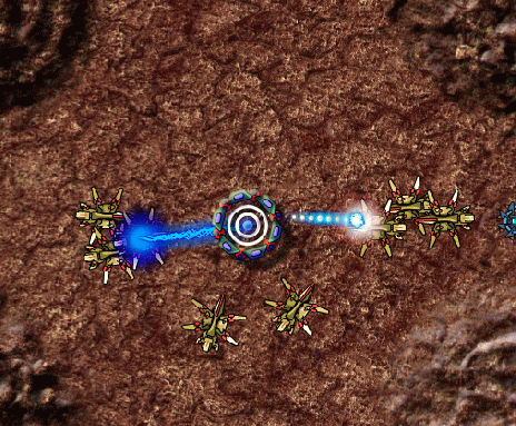
Since there has been a lot of complaints about the difficulty of lvl 1 and whining that MGM sux here is a video of how you are supposed to play it:

.
/* */
Now I need to write a tutorial / explain somehow in the game how to use it right =\ hate these things.

MMM 3 Beta testing


Comments

Oh that was SUCH a tease. Well...atleast there is beta. I guess that makes up for the horrible lie...

Its the same as full version, but without shiny menus, tutorials and crap like that. All 40 units are there as well as all weapons, abilities etc.

Not that big of a lie.

Well...I do love shiny menus.

Either way, pro work. Just finished trying the beta.
Any ETA's on it's full arrival?

Hey

You know, the biggest reason I never really liked your games was not the gameplay but the menus. The gameplay is usually pretty good but the menus are horribly cluttered and I can barley find what I'm looking for. It's all very nice and shiny, but actually too shiny.

Like the first screen. There's so much text there it's overwhelming and at first glance makes me want to exit because this game must be so complicated and really not worth my time to figure it all out.

What I would suggest is to make the eye draw towards the "Objectives" more than the hints. At the moment the objectives is so small that I really did ignore it and just went ahead and hit "start mission". And make hints small and brief. They're just hints after all.

Another thing that would help is to make the text "easier to read". By this I mean.. well at the moment the text is very bright (at the loading screen it hurt my eyes) and bold. It looks very cramped and to me that's annoying. Turn bold off, space it out, and like I said before be brief.

So that's the main menu/loading screen. Now I'm going to rant about the abilities/upgrade menu :)

So at first glance, again, too much text, text too little and cramped, bright colors are annoying to the eye, so many symbols buttons and thingies no idea what any of them do. Now, yes I *could* read the text but as I said before it just looks like there's so much text that I wont bother reading it.

So instead I'll try to mess around. What I'm getting at is this: Try to make your game straight forward in the beginning. You can add fancy things towards the end once the user understands the basics. So I guess I'm saying that you should make this as straight forward as possible and that I should be able to understand what I'm doing (basically) at first glance.

Well anyways, I messed around with it and as I hovered over the icons it explained what I needed to know, but like most everything else too cluttered.

As an example for the first 'upgrade' thing you said:
"Gravity Manipulator, enables you to pick up and throw your enemies. The ability has 3 power levels .. etc..."

Ok well to me that's a mouth full. You could condense it by saying:
"Gravity Manipulator, pick up and throw enemies", and just list the levels. By doing that I can assume that there are 3 levels to it and I know what it does. You should also emphasize the "Gravity Manipulator" imo..

Well, that's really all the complaining I have on the menus. In short, not so much text, make things clear [without the use of lots of text], make it not so shiny (literally) and I think you should be good. Now if you like the menu it is the way now, eh that's not my problem :P

As far as gameplay goes I'd say you got a good one. And I'm not trying to be an ass please don't take it that way.. just suggesting on what I think you should do, whether you do it or not that's your choice x|

>There's so much text there it's overwhelming

If a few sentences are overwhelming for you then I donnu... get some help

> And make hints small and brief.

I'm explaining the gameplay and I'm as brief as I can. Yet a lot of people still don't get what to do in the first level.

I would have made video tutorials for everything nut I don't wont it to exceed 10mb limit.

> well at the moment the text is very bright (at the loading screen it hurt my eyes) and bold.

Maybe I'll think about it later... there is a lot of more important stuff to fix.

Looks good so far. I loved the previous MMMs, and this doesn't look like it will be an exception.

I do, however, very much agree with the above post -- the text is extremely hard to read, and there's just too much of it. When I see huge blocks of text that clash against the background, the tendency is usually to skip over them and press random buttons.

wow!! its very very very very great!!! awesome! beta!!! i want play it complete! and i don't find bugs in that beta, that is a beta or an demo? is so perfect, very good!! tell me when you finished the complete game :D HI!!!

thanx

Well, it's cool, but I have to say that I like the slinging version. This one's cool, but I just like the other ones better.

this game is gunna be beastly!.......

....when its dun

o come on dude what the hell was that,u can do better than this im very disapointed.well at least this was beta.

The beta it's awesome, don't worry about bored pople comments ¬¬
Congrat^^

You told me you weren't gonna do beta testing >:(

Hmm...Well,all your games are first that hard that i give up,but then i try harder,and again and again and some day,after reading helpful comments of the users or even finding a way myself,i make it to get the first level.
The second.
The third..and so on,and so i grow on your games :D
Thats good.
In the end,i have told you the bugs i found in a PM before i´ve seen that there is the ability to comment directly here XD..well,have fun :P

hmm...
I really liked the old versions where the enemies just come from left and/or right because it allowed you to bounce your "missle" around.

I haven't seen you throw multiple missles around.... -.-
Tell me you can throw more than one missle at the enemy

Aside from those "problems" this game looks alright, I mean I have never seen anything of this kind before (you'll definitely get points for originality).

Hopefully this game is as good as MMM and MMM2

WANT TO PLAY X.X

Omg Yay first i hear about age of war 2 and now i hear about mmm 3 im so glad i can't w8 for both

don't be too sure that its coming soon buddy i mean its been almost two months we are waiting for that game.